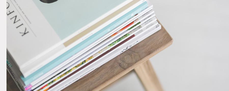
When you want to create your own magazine for the first time, you are bound to make some mistakes considering you are not yet experienced. Some first-time publishers make great magazines while for others, they end up giving up before they could even get started. The following tips will go a long way in helping you record success in this field.
Get inspiration in order to create your own magazine professionally
Before you start to make your own publications, visit a newsstand and buy a number of magazines that attract you. Carry them home and start to list some of the reasons as to why you were attracted to them. Was it the photos? The subject used for the magazine? Is it the layout? Pick out the elements that you like in the magazine to give the inspired layout of your magazine. And be creative in this case. Do not allow the computer to think for you on how to create your own magazine layout. The free online magazine maker software is meant to work for you and not you to work for it.
Pick a great cover photo
Do not be afraid of spending when it comes to selecting the cover. The cover photo is the very first thing that readers look at before they can even get to the contents. It gives you notice and may end up being picked. It goes without doubt that any cover photo that you use should be great and of high quality. The resolution should be well considered.
The photo that you have chosen should be an interesting one to your potential readers and one that tells the story in brief. If you use a frowned face of somebody who is not even known will do you no good. The photo has to be recognizable to your target audience, has unusual colors, and shows some action. It should be taken from not-usual angles. Combining all these makes your magazine-cover perfect.
It is important to bear in mind that your magazine has a single chance of creating an impression. Let it do that better using a great magazine cover.
Create your own magazine using a nice font
The font has an impact on how professional your magazine is. The reader is easily confused in a situation where too many font faces have been used. It becomes hard for them to separate between a story and the advertisement. Also, too much of the font can make the eyes tired.
You may find it beneficial to use one or two font families. One can be for the headings and sub-headings while the other for the text in the body.
Some fonts like Serif, more so the small one, have been shown by research to be easier to read.
CAPS makes the reading process hard. For emphasis of a word, use bold instead of making it CAPS. You may also want to use the condensed or extended version of a font to make a point rather than hitting the caps lock key.
Do not be close to the edge
Some people create their own magazine with a layout whose text is too close to the paper’s edge. Do not focus on filling every little space on the paper. A margin of about 1/4″ is suggested to be the minimum while 1/2” is the best. It is more professional to add some white space. On your end, you will not be troubled by worries of some text being cut off.
Stay away from the Clip Art
Research has found out the adults do not buy many cartoons. You are in the business of selling a story to a buyer. Before he could even read, the graphics can make him start whether to read or avoid. But in case your article has to do with children, feel free to include some, but not excessive.

